Color & Autism:
How to Create an Autism-Friendly Palette
For those on the autism spectrum, colors can have a profoundly positive or negative influence on how they experience their environment. As designers, it is our responsibility to understand which colors are best suited for those with cognitive and neurological differences to create a comfortable experience. In this guide, we will explore which colors may be more autism-friendly and how you can consider them in your designs.
What Colors are Autism-Friendly?
The association between autism and colors has been known since the 1940s, when Dr. Carl Jung identified that certain colors can evoke particular emotions in people on the spectrum. It’s important to note that each individual may respond differently to certain colors depending on their personal preferences — so it’s best to experiment with different shades and focus groups and recognize that this guide is not representative of all people on the spectrum. However, it can be helpful to understand how color may be perceived and translated by the neurodivergent brain.

Pinks & Lilacs
-
Pastel pinks and lilacs can have a calming effect on individuals with autism, as these colors evoke feelings of security and love. Not only do the pastel tones create an atmosphere of peace, but they also often bring about tranquility for those that are autistic - making them perfect hues.
Have you observed the use of pink and lilac on design-a11y.com? It's both a matter of personal taste as well as being connected to the creator's neurodiversity.

Blue & Green
-
Blue – Blue is a calming color associated with trustworthiness and reliability. It is often used to help those on the autism spectrum feel more relaxed, which can be helpful when dealing with stress or anxiety.
Green – Green is often seen as a balancing color due to its ability to bring about harmony within any environment. It is known for having both soothing and energizing qualities that make it ideal for those on the spectrum who need some extra support regulating their emotions.
Muted greens and blues are ideal colors to create an atmosphere of calmness for those with autism. These hues have much shorter wavelengths which equate to reduced stimulation in the brain as compared to brighter shades. Soft tones of green and blue can help reduce sensory chaos, especially amongst autistic users who often struggle with various conditions related to over-stimulation. Introducing this calming palette will allow autistic individuals time to process their environment more effectively without becoming overwhelmed by too many stimuli.

Yellow
-
Yellow has long been associated with creativity and happiness. It is believed that yellow helps those on the autism spectrum focus better and boosts concentration levels.

Orange
-
Soft, muted oranges can be autism-friendly colors, providing comforting warmth. Using soft orange tones in food-related brands may help stimulate appetite.

Neutrals
-
Colors such as beige, greys, creams, or tans are great for people with autism; they’re not distracting and therefore can have a calming effect.
Though neutral, “Pure White” #ffffff can be overwhelming, it can be too bright and tiring for the eyes and uncomfortable for those on the autism spectrum.
To lessen this harshness, try using muted tints to temper the brightness of Pure White.
There are many factors involved when creating an autism-friendly space—but choosing appropriate colors should be one of them! By understanding what colors are best suited for individuals on the spectrum, you can ensure that your design not only looks aesthetically pleasing but also promotes cognitive function and processing for the neurodivergent mind.
“Sights, sounds, sunlight, changes in barometric pressure, smells, touch, and colors can have a profound effect on people with autism. Denise Turner, a designer, reported in Color & Autism: Seeing Color through Autistic Children’s Eyes that 85% of autistic children saw colors with far greater intensity. It has also been theorized that autistic people may have a significant increase in color differentiation, explaining the effects small changes in color hues can have on them. This is not surprising when you consider that autistic children experience the whole world with greater intensity than their neuro-typical peers. Lights are brighter, sounds louder, touch is more intense, smells are stronger, and colors are—more colorful.” - Jeannie Davide-Rivera
Book a Workshop
What colors may cause discomfort or distraction to a person on the spectrum?
If you're utilizing a vibrant and robust hue for your background, it could be taxing on the user's eyesight. You don't want to create an interface that is uncomfortable or difficult to look at—choose colors with care!
Bold and vibrant hues capture the most user focus, however too much color in a large area can cause overstimulation of the retinas which could lead to eye fatigue. Highly saturated colors may cause distraction, as well as colors like red, which may invoke negative emotions. Red often triggers aggression or irritability in those with autism.
When creating an autism-friendly design, the best thing to do is stick to a minimal color scheme and avoid bold hues altogether. This will help reduce the amount of external stimulation that could potentially cause discomfort. Aim to create a color palette that is neutral, calming, and unobtrusive while still being visually stimulating.
Avoid Highly Saturated Palettes
Pro Tip:
When selecting colors, avoid the upper right corner of the color picker.

ⓧ Don’t do this

✓ Do this
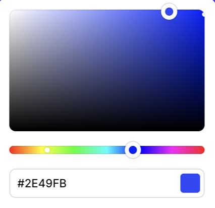
✓ Do this
Bright colors are not completely off limits
When using very bright and highly saturated colors, recall that balance is the key to avoiding strain or discomfort. If you need pops of vivid color in your design, make sure to use them sparingly and proportionately. Otherwise, brights and neons may create an unappealing eyestrain for users.
Restrict your bright colors to your accent colors, used in a 10% ratio you can include them in your palette. These colors can be used for your CTA button background or decorative elements, just do not use them for backgrounds or text.

The sample palette uses neutral tones, paired with bright accent colors. Please also note that this palette included corresponding text color that passes minimum contrast requirements. Learn more about contrast tools here.