Designing Accessible Buttons
Designing accessible buttons should be an integral part of any design system. By taking the time to consider accessibility when designing buttons, you can create a more user-friendly experience for all types of users.
The following resources should get you started with designing your buttons with a11y in mind.
8 Button
Must Haves
-
Your button text to button background should have sufficient contrast. But also consider the contrast of your button background to you page background.
-
This isn’t is stressful as it sounds, typically you can use your hover state UI + your focus indicator to satisfy your button focus state. However, don’t forget that your hover and focus state should have a design element beyond just color to signify the change in state.
-
Use consistent CTA styling, don’t mix button shapes like sharp corner rectangles, with pill buttons. This can cause confusion for the user and honestly is just not a great design practice.
-
This can be accomplished by consistent use of color, by identifying a specific color as your primary CTA color. In order for this to be effective, you would want to limit the use of that color in non-actionable interface elements. You can also help make buttons clearly actionable by using a design element that adds depth. Very flat and minimal designs can sometime suffer from less apparent actionable elements.
-
This is where people usually get tripped up, because 90% of the buttons we see online use a color change to signify hover. Unfortunately that doesn’t make you buttons very accessible. Any of these solutions will satisfy that requirement. Adding a stroke, underlining text, bolding text, adding a small design element. Also consider more elaborate hover design changes aided by CSS transitions! You will spot one we love on this site for our primary CTA.
-
Designers, don’t overlook the opportunity to design your focus indicator. You don’t need to use the default styling. A well designed focus indicator can feel much more seamless with your UI.
-
Don’t apply overly “busy” styling to buttons. Styling effects to avoid: heavy textures and background patterns, heavy text shadows, bevels.
-
Ensure adequate and proportional horizontal and vertical padding. Apply this formula to make it easier:
Vertical padding is x the horizontal padding is 2x

Figma Files
-
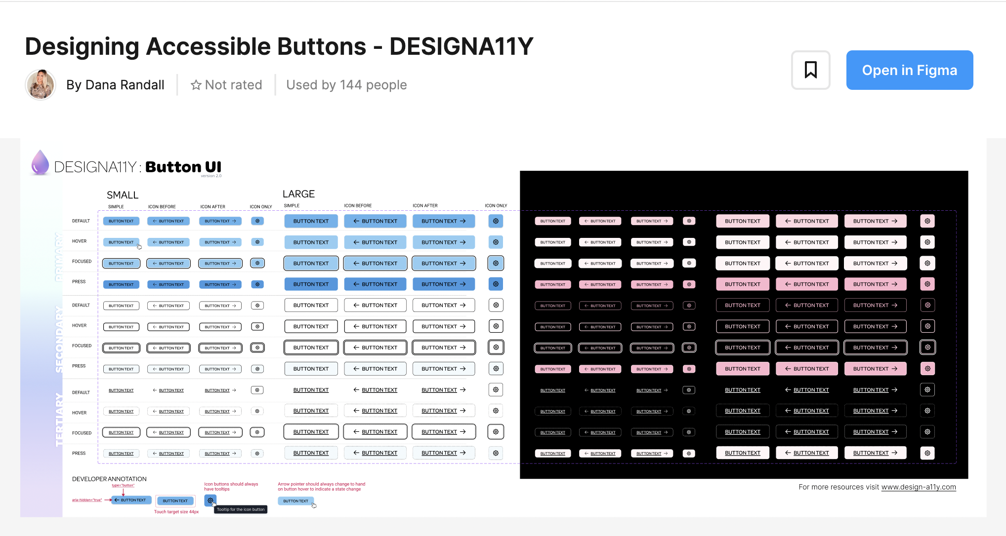
Designing Accessible Buttons
Designing accessible buttons for a user interface should be part of any design system. Atoms such as colors, shapes, and sizes should all play into the accessibility standards that are needed for any given button. Color contrast is especially important to ensure users with color blindness or poor vision can interact properly with the user interface.
This file will get you started on the core states needed to design your accessible buttons.
Avoid unbalance horizontal spacing
The padding on either side of your button text should be 2x the vertical padding. The exception to this recommendation is for mobile, where it’s fine for the button to span the entire width of the screen.

Avoid unbalance vertical spacing
The padding above and below your button text should be the same/equal height to your text. This is a X in your button padding formula.

More detailed tips for designers are available in our workshops
Book a Workshop
Resource Links
Neurodiversity.design Buttons, Links & Inputs