Designing Dizzy: Seeing the world through an accessible design lens
Originally Published on LinkedIn: Article Source
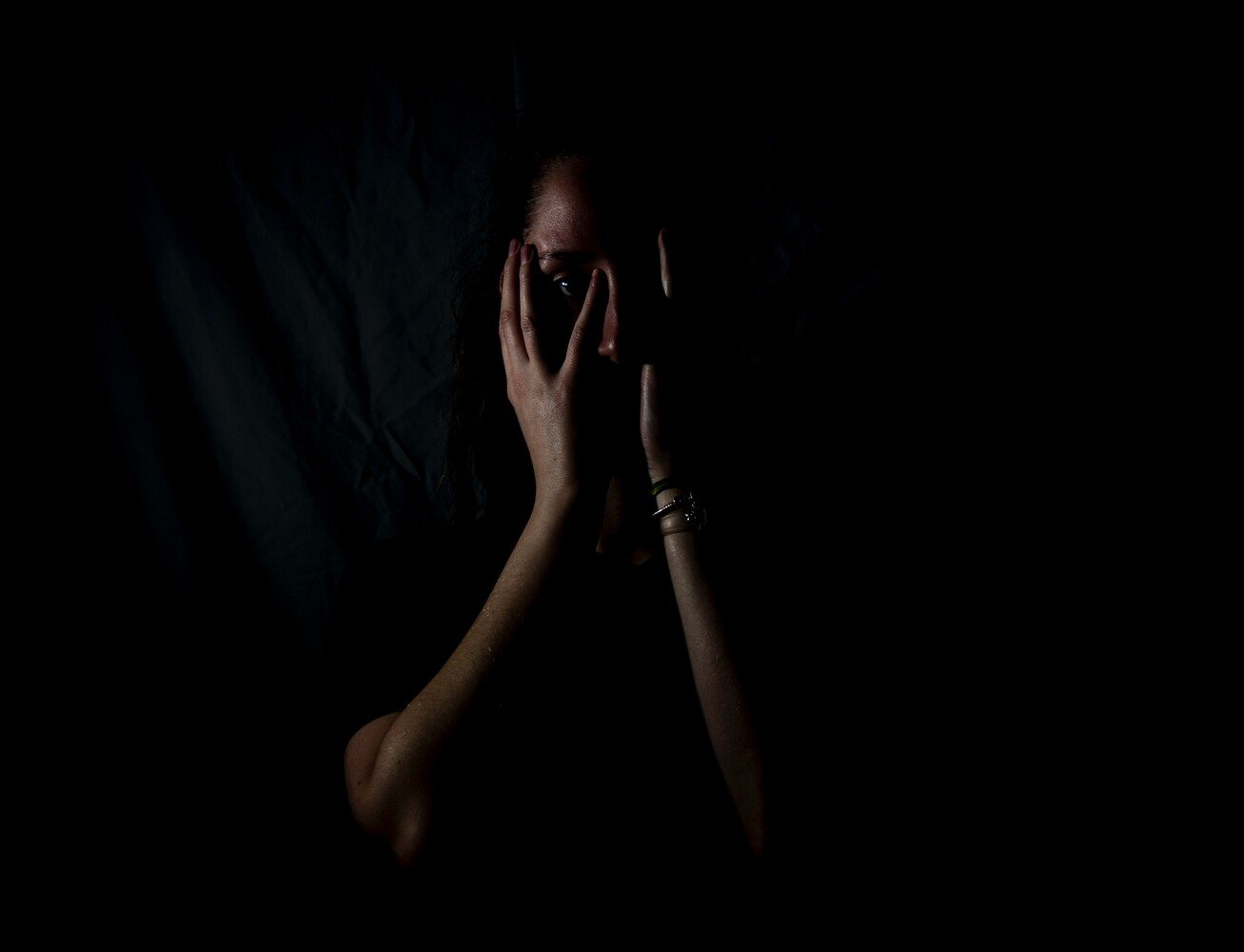
A few months ago I posted about my sudden facial paralysis, hearing, vision, taste and balance loss. I am Dana and I am a Ramsay Hunt Warrior!
Today’s update: I am thrilled and grateful to have regained 90% of my facial function. This can be one of the more devastating injuries from RHS (Ramsay Hunt Syndrome), as it’s what people immediately see. Not all RHS warriors regain their facial mobility. However, I do continue to suffer with hearing loss and damage to my vestibular system.
What is a vestibular system?

This is the internal gyroscope that controls your balance and the signals sent to your brain to help you understand your place in space, mine is a bit wonky… Ok it's a LOT wonky, like 89% not functioning correctly. That's a lot of dizzy for one person to navigate.
Now, when I first posted I said that I was certain that this experience would inspire something meaningful, I wasn’t sure what that would be and I’m certain that this is only the beginning. But, I wanted to share the first of what I hope is many great things this disability will continue to inspire.
Accessible Design!!!
As a career creative I have always been passionate about all things design (graphic design, branding, web design, interior design, event design, etc.) but once I became vestibularly challenged I saw the world through a new lens.
People with vestibular dysfunction tend to find certain design decisions… disorienting, distracting, triggering and sometimes completely intolerable. The good news is that correcting these design decisions can also just be "good design" practices. While I always had a history of finding many designs, spaces & places unpleasant, cluttered or busy; it wasn't until I got RHS, BPPV and ultimately Meniere's Disease that I truly understood how these designs can actually be harmful and trigger potentially dangerous episodes for someone with this or similar disabilities.
As I was doing research to better understand my own disorder, I stumbled across a video from 2014 "The UX of Stairs - When simple tasks aren’t so simple" after watching this video my immediate reaction was "I feel seen!" They did such a great job helping those without vestibular issues understand what a world for someone with this disorder experiences. Of course, I was also pleased to see this talk coming from someone that also works in design, as we tend to speak the same language.
I wanted to take my own stab at providing some examples of design decisions that are not accessible, along with some examples that the average person might find disorienting enough to help demonstrate how and why these design decisions can be problematic.
I also want to go on record that as part of my journey towards accessible design I have taken a look back at many of my own design decisions of the past and cringed! There are so many past design directions in my own portfolio of work that I now recognize are problematic. But the past is the past and the best we can do is to do better moving forward. So in this article, I hope if you are reading this and you are a designer, you can try to consider some of these things when doing your next design project.
Physical Spaces
Let's start with physical spaces and interior design. I feel starting here will be the easiest place to help demonstrate how some designs can be problematic. I also want to clarify that I'm strictly covering "problematic from a vestibular sensory angle" and not touching on accessibility from a more general approach. If you are designing a home, office, experiential popup or store, these examples may be useful references.
TRIGGER WARNING - some of the upcoming images may be difficult for a vestibular dysfunction sufferer to view.
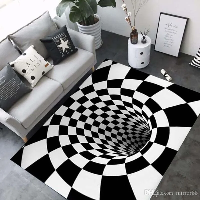
Starting from the ground up... I LOVE a fun cement tile or graphic print. But some patterns may intentionally or unintentionally be impossible for someone with vestibular dysfunction to navigate.
Here is an example of unintentional challenging spaces:

While the carpet pattern alone may not be obvious, in the hallway setting with repetitive doors and lights, a space like this can be difficult to navigate. Yes, this basically includes almost every hotel hallway you have ever visited.
Now let's go to extreme and intentional. The reason for this example is to better understand the sensation someone like myself experiences in the above image. These "optical illusion" flooring designs would legitimately leave me on the ground in tears, with the hands over my face begging for help. Now I'm certain you have seen this type of flooring in a popup somewhere trying to be cute, just be aware that while it may be fun for many, it's not accessible. This type of optical illusion on the ground would definitely trigger intense vertigo and likely induce nausea and all the fun stuff that comes along with that. If you are going to implement anything like this, it would be best to include a clear warning at the entry to allow those that need to, the option to avoid this space all together.

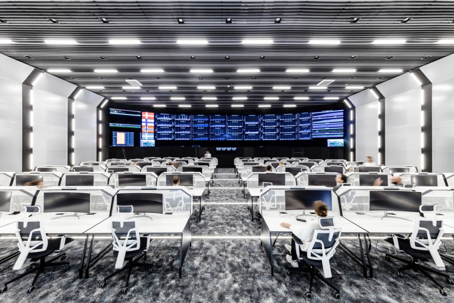
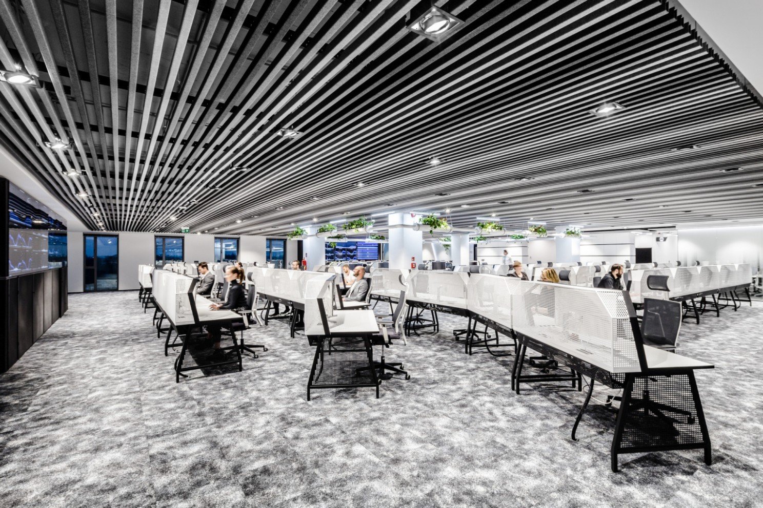
Now let's move our eyes up to whats happening above our heads, in lighting and ceiling patterns and textures. These examples are from a great resource for office design images, and while I'm certain they didn't intend to create a space that is problematic. This companies office would be a space that a person with a vestibular disorder would be unable to work in.
Now let's go a bit closer to home, this example is a public space and one that I have to navigate more often than I would like. I actually avoid this particular subway station because it is so triggering for me, this becomes a very scary place for me to navigate. This is the subway entry/exit at Hudson Yards in NYC.

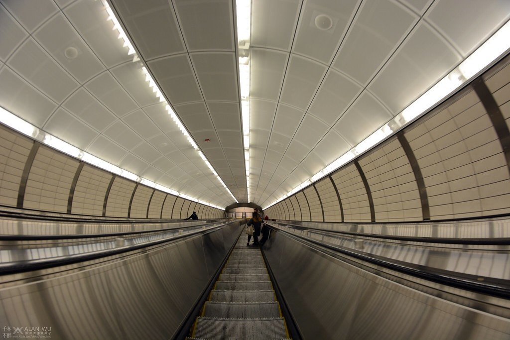
Combining this very long escalator with the actual motion of an escalator makes me sweat just thinking about it. I recently had to go to this subway station and while I visited it plenty of times before having a vestibular disorder and never loved the experience. I recently was there and had to hold on for my life... with my eyes closed until "the ride was over" just to get to my destination.
Beyond the Web Accessibility Guidelines
Today it's more common practice to give a website or presentation an accessibility audit. There are also lots of great tools out now to assist with making sure your site, app or deck is accessible. I wanted to address a level of accessibility that won't be picked up by these tools. As a designer we have a responsibility to not only create beautiful things and to use design as a tool to solve a problems, but we now also need to be the first line of defense to advocate for the spectrum of disabilities through our design practice. We will never be perfect, but we must always be learning and listening in order to improve our practices and lead by example doing our best to make the things we create as available for as many to enjoy as possible.
Now, when you hear about accessible for the web you are typically addressing the following audiences: (borrowed from this article about accessible design)
Motorized/Mobility: People who face difficulties in using their hands and are suffering from tremors, loss of muscle control and muscle slowness. People who have challenges from Cerebral Parsey, Muscular Dystrophy, have suffered strokes and any kind of conditions in which a user would face difficulties in using their hands.
Visual: Users who face challenges with poor eyesight, color blindness, blindness and various other types of eye impairments.
Auditory: Users who struggle with hard of listening and are suffering from deafness or hearing impairments.
Seizures: Users who suffer from photo epileptic seizures that occur due to visual strokes and flashing effects/moving objects.
Intellectual Disability: Users who suffer from dyscalculia, dyslexia and developmental disabilities.
Mental Disability: Users who suffer from a cognitive disability that can affect various origins such as memory, affection, development, and ability to solve logical problems.
But when dealing with vestibular disorders it's often a combination of things that can lead to something not being accessible. Again, continuing on my research to better understand my own disorder and honestly how to understand potential triggers in order to avoid them, I stumbled across this article. Facundo does a fantastic job of outlining some specifics to avoid or adjust in order to be more vestibular friendly.
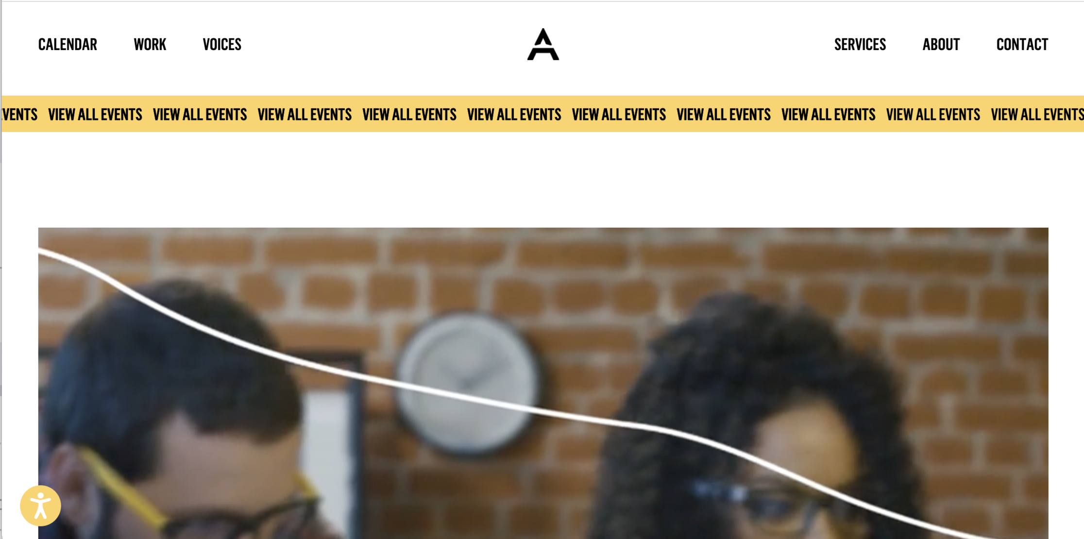
I wanted to provide an example of my own FAIL in approving a design direction that I didn't understand at the time was problematic (remember those cringeworthy moments I mentioned above). The homepage of this website has a scrolling ticker'like "view all events" button/banner that took many hours to even get coded right. Yet now, I can't go anywhere near this page without it setting off an intense vertigo attack.
This isn't a simple rule like "no horizontal scrolling" call to action buttons, there is a wide spectrum of things that can trigger someone to have an episode. However, there are certain elements that sit on the highly likely to trigger list. This means any animation needs to be carefully considered.
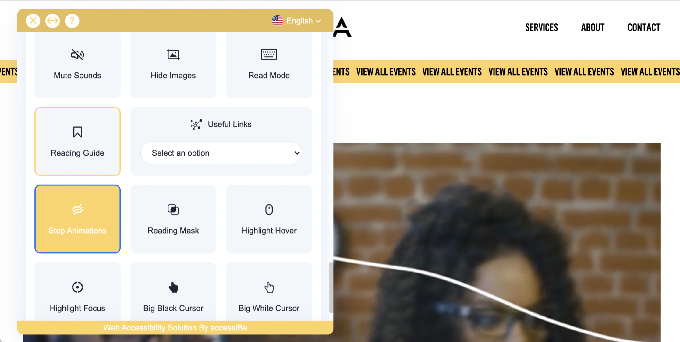
There are the accessibility widgets that quickly adjust your site to be "more accessible". Proceed with caution on these, as they have been known to open to door to some liability. I would say if you are a business or company, you would be better off hiring true accessibility partners or advisors and not rely on a widget. If you are hoping to make your personal website more accessible the widget is better than nothing.
Here is an example of a one-click stop animations feature that makes this website tolerable for me.
Honestly, my vestibular disorder was a wake up call for me. But I also look to find the positive in what feels like an overwhelmingly negative experience. This will make me a better designer.
In general these types of design decisions like parallax, bright contrasting colors, animation, busy textures and patterns, long blocks of text and scrolling text need to be avoided or quickly disabled. Trust me, I'm bummed (a little) many of these things were the cheap tricks up our sleeves as designers to bring things to life. But sorry... I will own my own mistakes here and realize that in my journey to be a more accessible designer its time to put those tricks in a little box and store them away... forever.
-- Dana: designing dizzy
(This article was written with the help of speech to text tools - because I'm dizzy - please excuse typos or grammatical errors)