How Accessible are these 2023 UI Design Trends?

If you’re a designer looking to stay up to date on the design trends of 2023, then you’ve come to the right place. The technology world is constantly changing and evolving and as a designer, it can be hard to keep up with all the latest trends. Upon perusing this article on the 2023 visual design trends guide, I set out to immediately assess the accessibility of each trending style.
Not only should your design look aesthetically pleasing, but it must also be user-friendly and accessible for all. That’s why I've taken a close look at the 2023 UI design trends to see how they measure up in terms of accessibility. Will these trendy UI designs pass accessibility tests? Read on to find out!
(Motion content warning - this article contains some animated gif in the next section for motion design. If you would like to skip ahead past that section please click here.)
Motion Design
Motion design is one of the most popular design trends of 2023 and it involves creating graphic elements that move or change in response to user interaction. This type of design can help engage users by creating an experience that feels more interactive and dynamic than static visuals. It also helps create a sense of depth and movement which can help draw attention back to specific elements on the page or app.
While motion design isn't completely off-limits (although I prefer you take a less is more approach with it) when it comes to accessibility, there are a few important considerations to ensure your motion design doesn't create an unintentional accessibility nightmare. As with any design concept, the user should always be at the forefront of your mind and motion design should never create a barrier to usability.
To help ensure accessibility in motion design, certain guidelines must be followed. The motion should always be smooth and consistent, so users can easily anticipate how elements will move or change when interacted with. You should avoid hectic, intense, or chaotic motion effects and if you are insistent on using motion you MOST IMPORTANTLY need to make sure that you offer users the ability to turn off these motion effects easily.

Midwam used GSAP library to create their website. See it live: Midwam
Furthermore, you must ensure your site or app is developed to respect the user's device setting for reduced animation. Imagine you have set your mobile device or laptop to reduce motion and animation because you suffer from a vestibular issue, and then you arrive at a website with wild and intense animation effects that completely ignored that accommodation.

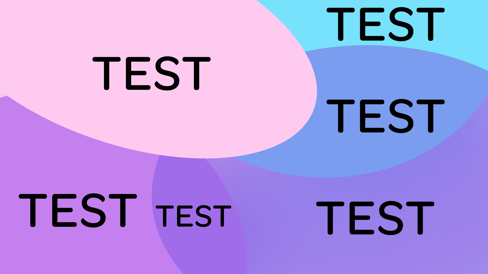
Upper left to right: Estee Lauder, Apple, Duolingo, Wishes In Words, The Virtual Economy ,Wickret
Tip #1:
(Motion Skip Anchor)
When conducting quality assurance (QA) on your interface designs, be sure to test if motion is disabled when users' accessibility settings are set to reduce movement. This should always be done across both desktop and mobile devices for a successful user experience. Moreover, ensure that visitors have the option to turn off this motion with ease. To ensure the user is comfortable while experiencing motion on your website, don't catapult them into it without warning. It's also recommended to provide a notification similar to what appears before movies that contain images that flash rapidly - this allows users to choose whether they would like to proceed or not. Don't forget: intense motion experiences shouldn't be unexpected!
Clean Design
Clean design has been around for years but its popularity is growing in 2023 as people continue to search for simpler designs that are easy to navigate and understand. Clean designs tend to focus on minimalism, using white space strategically throughout a website or app to make content easier to read and digest by removing unnecessary elements from the page. This type of design is great for focusing attention on specific calls to action while also allowing users more time to explore other parts of the site without feeling overwhelmed.


Fortunately, clean design is well aligned with accessible design, just be sure you are meeting minimum contrast requirements for text and graphic UI elements. This is essential to ensure users with impaired vision can access and understand the content of your website or app. Additionally, be mindful that a clean design doesn't mean getting rid of all visual cues and indicators.
Ensure that you are still giving your users the necessary feedback they need to know if an action is completed effectively or if it needs to be done again. Your elegant design should take into account WCAG requirements such as mouse hover, focus states, and indicators in addition to appropriate error messaging.
Aurora Gradients
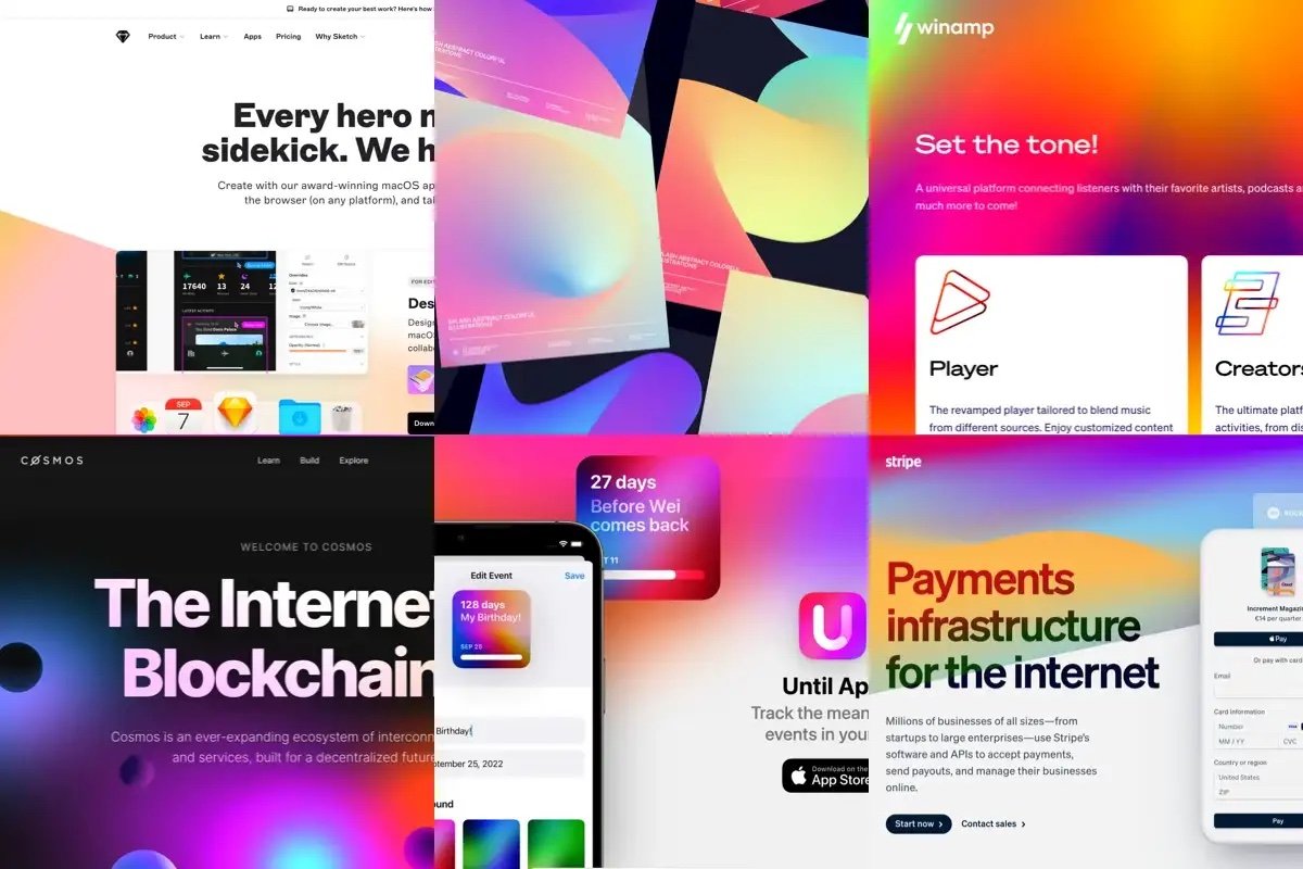
Gradients have been around forever but recently they are making a comeback with their modern “aurora gradients” look. Aurora gradients are vivid color palettes that use bright saturated colors with pastel shades mixed together to bring an eye-catching touch to any website or app interface. These gradients can be used sparingly or as bold backgrounds depending on your desired aesthetic and they create an overall sense of vibrancy that will make any site stand out from its competitors.
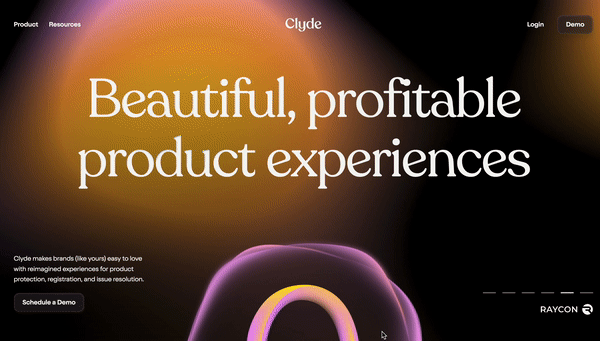
Example of aurora gradients use. See it live: Clyde
Now some people may say to avoid gradients altogether, but that's not my point of view. As you can see from my design of design-a11y.com I use a static aurora gradient as a background. You can use them, but I'll tell you the trick of how to make sure you stay accessible with these multicolored soft organic gradients.
I do a workshop on this to dive deep into how to approach this. But to give you a high-level explanation here is how I tackle accessible gradients.
Tip#2
Step 1:
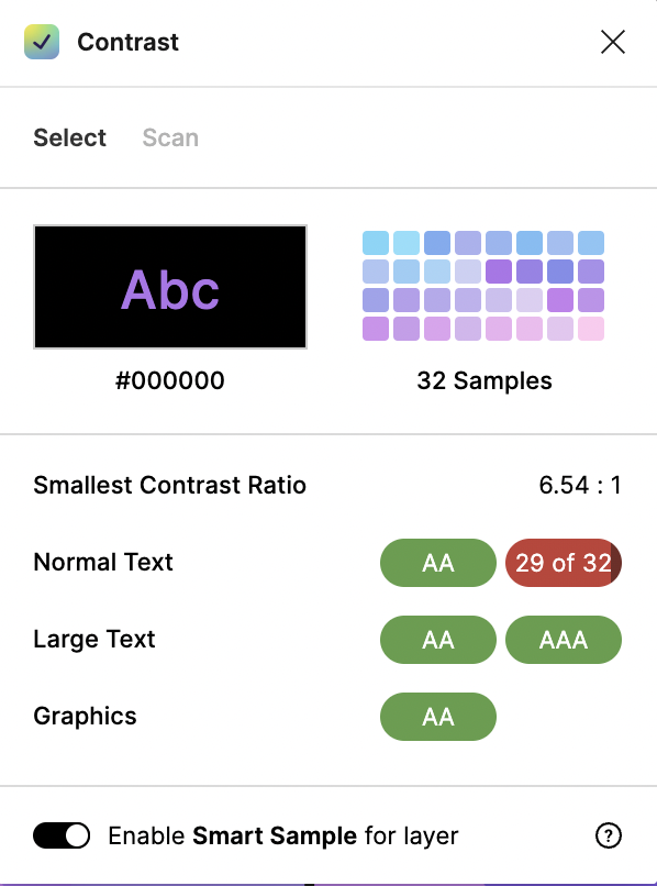
Be sure you are starting with an accessible color palette. Check each core color of your background against the text color you plan to use. In my case the text color is black. Here is a screenshot of those contrast checks.


Step 2:
After you create your blurred aurora gradient you need to test the contrast of your text over that gradient. This gradient creates many different color blends so your 4 initial colors now have 100s of shades. I prefer to use the Figma plugin called "contrast" to test gradients. This plugin samples 32 points on your design to ensure your contrast passes. Keep in mind that automated scanning may not flag contrast issues over gradients, especially if your background is an image and not a CSS gradient. So it is your responsibility as the UI designer to test your gradients before development.


Step 3:
If your gradient has areas that may not pass color contrast, like in the example below where the white logo intersects the bright green, you must ensure that your site or app is developed in a way to protect against those collisions happening. It's especially important to test this in your responsive designs where elements can move around a bit.
High Contrast / Dark UI Mode
The dark mode trend isn't going anywhere anytime soon, especially when it comes to UI design in 2023! High-contrast visuals combined with dark backgrounds provide an interesting twist on traditional web design that helps draw attention toward key features while simultaneously providing a sleek look with plenty of energy savings (and eye strain relief!). In addition, dark mode settings also make the text easier to read by providing a higher contrast between letters, words, and other elements on the page which helps improve user engagement even further.


If you're looking to improve accessibility on your website or interface, dark mode, and dark UI are excellent options. I've heard from colleagues with low vision that it's much easier for them to navigate when they can choose a dark mode option. With that being said, just like a broken record - make sure you meet the contrast requirements so there isn't any confusion! Avoid using dark gray text against black backgrounds, as well as vice versa - check those contrasts carefully!
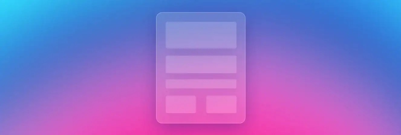
Glass Effect Buttons & Navigation
If you saw my teaser video, I mentioned that many of these trends aren't new. Glassy, bubble effects were super popular back in the early days of Photoshop with some preset layer effects. A more modern version of the glass effect became popular in 2013 and was gaining popularity again in 2020. The article that inspired this post referenced this as a 2023 UI trend, so I feel it's important to share my take on the accessibility of this style since it seems to be sticking around.


Glass effect buttons & navigation have become increasingly popular over recent years thanks largely due to their unique 3D look that adds depth and dimensionality when used properly within an interface. The glass effect is achieved by overlapping multiple layers with different opacity levels giving them a realistic glassy finish that makes them appear more tangible than traditional flat buttons or icons which helps create a more engaging experience for users overall! The other aspect of the glass effect is to blur the background that the UI element is over, this is what gives that more realistic look and feel associated with this trend. Here is another older post on the glass effect or glassmorphism that I found interesting.
Now, the glass effect isn't in itself an accessibility issue. This will fall under the similar concept of aurora gradients. The glass effect means there is the transparency of the UI element and its background. So this means you have many potential color blends to deal with. It's not practical to be able to test this the same way you do aurora gradients, but I have two recommendations.
Tip #3:
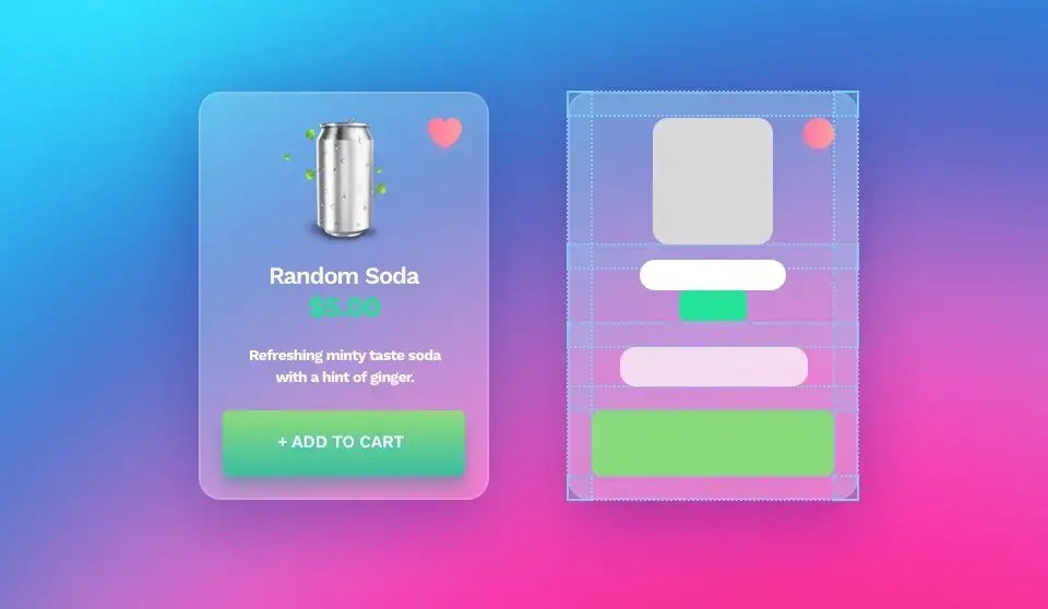
Lessen the transparency of your UI element so that even over the darkest or lightest collision you pass contrast. Test your glass element over black and white to be sure you pass on those extremes. Also, you can spot-check your UI using the contrast plugin again, but remember that this isn't future-proof, the moment someone uploads a new content element, a new image, or background you do run the risk of bumping into some contrast issues. And finally, if you are using glass as your card background (like demonstrated below, ensure your interactive UI elements meet your contrast requirements and the right spacing to define the hierarchy and visually “group” all the related objects
So for glass effects, this one I say... proceed with caution.
So there you have it - Those are my accessibility tips for those designers that want to explore using these UI trends for 2023.
———————
Image attribution: Since this post is a response to this article, I have used some images from that original article to demonstrate the topics discussed.
———————
#2023DesignTrends #UIdesigners #UI2023trends #UXdesigners #UX2023trends #UXUI #UXtrends2023