I asked AI to design an accessible color palette
AI generated image of color swatches
The robots are taking over!!! or maybe they aren’t…
I love AI, especially generative AI platforms like Midjourney. I have really found a new creative 🐰 rabbit-hole 🕳️ to go down in my free-time. I love how it can combine my creative brain with the experience of discovery, surprise and delight. I have been refining my prompts, learning how to create more photorealistic imagery, using AI to create everything from headshots to art for my Samsung TV. It’s a blast!
But outside the creative party 🎉 i’m having in my free-time I have been seeing some very interesting things coming to more commercial use of generative AI. I promise to get more into that soon (coming to a LinkedIn Live soon!) but I wanted to start with some basics.
What if I asked AI to generate an accessible color palette for me that met WCAG minimum contrast requirements? Would the colors palette be pleasing? Would it pass?
Well, I guess you don’t know until you try.
Before I take you on my journey of how AI did creating accessible color palettes (and if I’d hire them again to do the job), its important to level set on what an accessible palette is. This is the very baseline of creating an accessible brand identity. Later this can be evolved into creating an accessible color system, this is a bit different because it also incorporates the use of color and the meaning of color. Here is a great case study of what that looks like.
Accessible Color Palette 🎨
An accessible color palette is an essential part of designing digital content that can be experienced by everyone, including individuals with visual impairments and color blindness. To create an accessible color palette, designers must choose colors that are distinguishable from one another and contrast enough to make it easier for everyone to read or understand. The WCAG (Web Content Accessibility Guidelines) sets the minimum contrast ratio between text and background so that it can be read easily by people with visual impairments. Designers can use color contrast analyzers to check if their color choices meet these guidelines. Additionally, designers can make room for alternative color schemes and customize their design based on the needs of their users, making their content more inclusive and user-friendly.
So I popped on over to Discord to my friendly little Midjourney Bot and I asked it the following:
/imagine : create a color palette of 6 shades including blue and red that meets accessibility wcag color contrast requirements --s 750 --v 5 --q 2

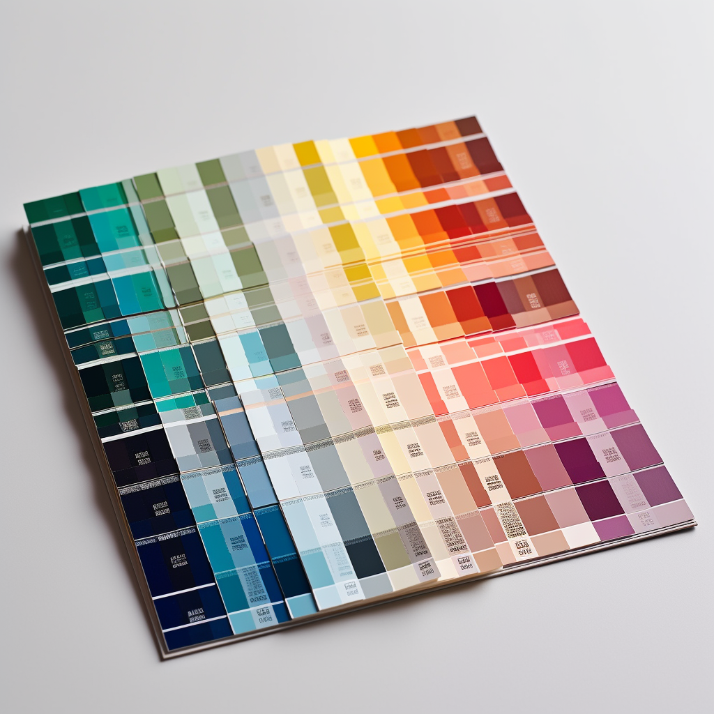
Here is what I got…
Well, I have to admit I was not totally let down. I got 3 of the 4 images that resemble color palettes. My request for 6 colors was mostly ignored, but I have something here to work with.
So with my results I decided to focus my experiment on the 3rd image, it felt the most promising. There was a decent range of colors, shades outside of the requested red and blue. Now it was time to see how AI did, was this color palette accessible? How many color pairs would pass minimum contrast?

So I was off to Figma to set these swatches and test these colors. If you want to learn more about my “go to” tools to test color palettes, I have you covered.
I sampled some colors, and decided to test all the possible color pairs. This is how AI did. Holy Sh*t!!!!! Of 15 possible color pairs, 6 failed. That is not too bad, I’ve seen worse with human generated color palettes.

I wasn’t prepared to stop here, I recognized that my prompt already gave the AI an advantage by asking for a palette using primary colors on opposite sides of the color wheel. The complimentary adjacent nature of red and blue gave the AI a better shot at providing colors with enough variation to have a shot as passing contrast.
So round two… I asked AI the following:
/imagine: create a color palette of 6 shades including pastels that meets accessibility WCAG minimum color contrast requirement --s 750 --v 5 --q 2
This time I got this result…

A muted pastel palette from AI
The results were… less impressive. But I will also take accountability for a lackluster prompt. Two of the results were just muted retro vibed color wheels, very attractive but not what I requested. One was a nice muted pastel interior, and finally one resembled a reference image and some color swatches. So I went with that one.

This color swatch set only had 5 colors, so I opted to sample the darker tone in the images as my sixth color. I will say this palette is very attractive, I enjoy the desaturated muted tones. I asked for pastel and got more retro tones, but this I enjoyed this combination so it was time to test. Since this time I didn’t direct the AI of specific shades, I received a full spectrum 🌈. I was curious was this going to pass, these colors are all of similar saturation and brightness?
This is the result of my test:

Fail, Fail, Fail. Even with the addition of my green-toned dark gray this very pleasing palette was absolutely not within the contrast requirements.
I was bummed, both because I enjoyed the colors but also because it seemed like AI doing a decent job on the first round was looking like a fluke.
So like any good experiment… if it appears to be a tie, test again. I went back to my midjourney bot and adjusted my request slightly. This time I asked:
/imagine: six colors that have minimum color contrast requirements for WCAG --s 750 --v 5 --q 2

Three of the four results were just colors wheels, but this result was something I could work with. The colors were a touch primary for my taste, but I wasn’t here to judge Midjourneys taste, I wanted to see if when I asked for colors that met WCAG guidelines, did I get this as a result.
In this example I received 8 colors, since there were two similar blues and two yellow /orange shades and two red family shades I had to pick 6. I decided to give AI a hand and intentionally selected the darker red-burgundy and the lighter yellow. These would provide a bit more color range from the core primary tones.
But did they pass?

Of 15 possible combinations, 8 failed. Now this result wasn’t as tragic as the round 2 result, but with more pairs failing than passing I had to consider this a fail.
Is that fair? maybe not. I would say this wasn’t totally a train wreck. I know many brands that have half or less of their palette passing contrast pairs. This isn’t a full stop blocker. But I do feel that AI is not factoring in the WCAG contrast requirements, it’s giving me some color swatches and the result is likely inline with any random palette generator.
So for now… the humans keep their jobs. I still highly support the use of palette generators to help get you out of a creative block or to offer up some unexpected pleasant combinations. I do not think AI and Midjourney are there yet when it comes to instantly spitting out accessible color palettes.
However it’s only a matter of time for these requests to become a reality and maybe reduce the amount of contrast testing we have to do as designers, by starting us out with combinations that have already been vetted to meet minimum requirements.